
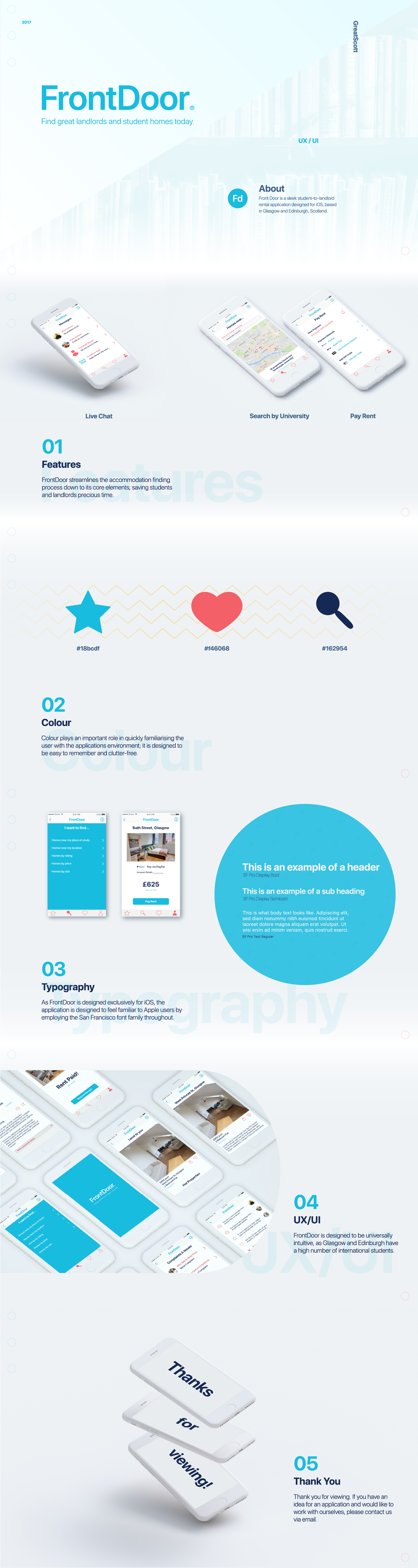
Brief
As part of my second year UX project, I was tasked with developing a brand identity and mobile prototype for a student accommodation app based in Scotland.
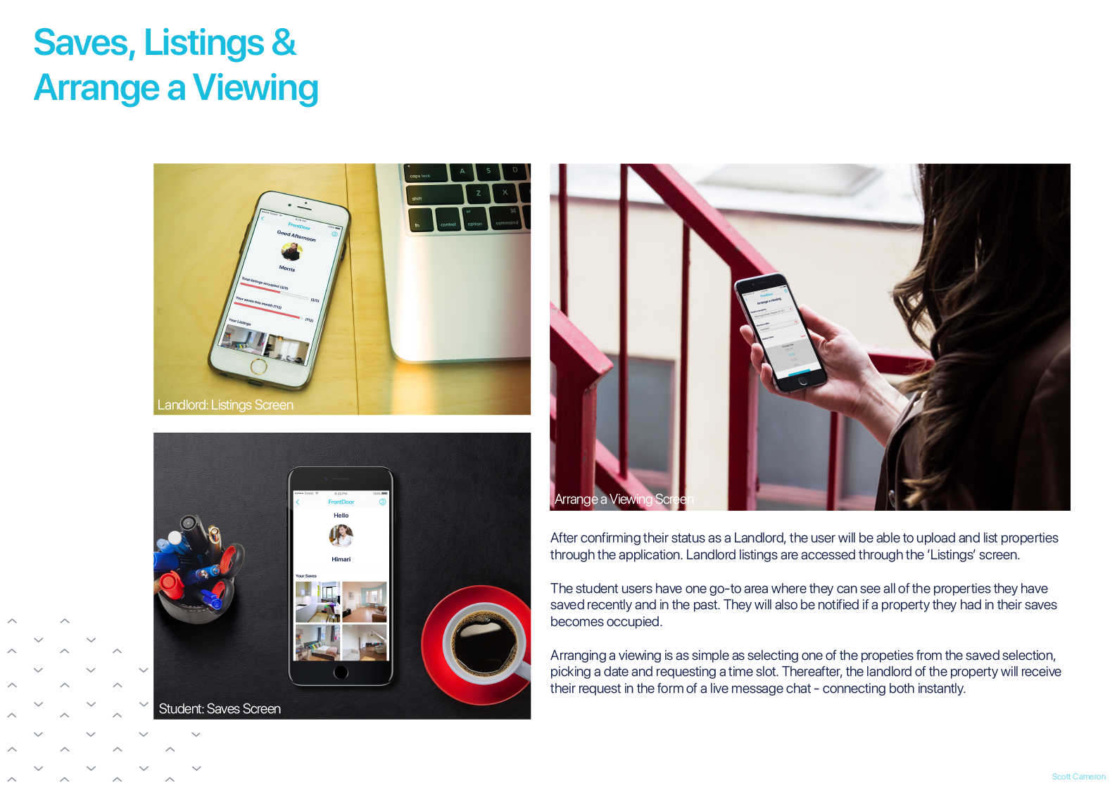
The brief requested that the final prototype should allow students to find student accommodation, as well as include functionality for landlords to upload and manage their properties too.
Proposal & Planning
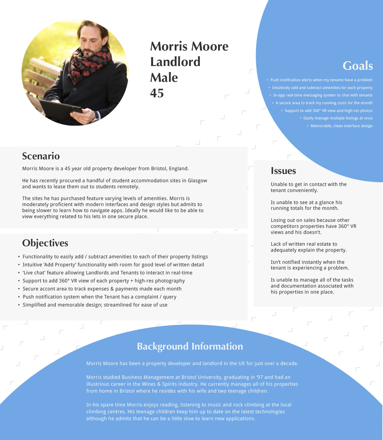
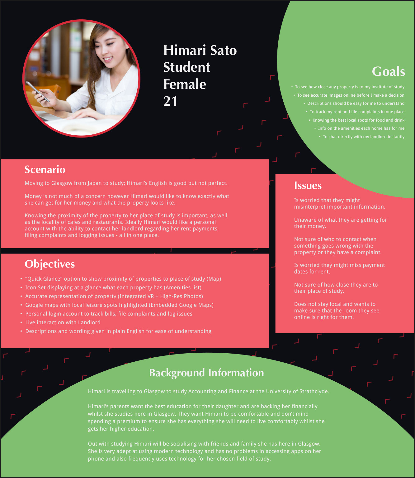
I opted to create personas for users who reside outside of Scotland - an international student from Japan and a landlord from England. This created an interesting challenge of making the UX feel accessible for people from a varying age and cultural background.
Developing the UX
To test the flow of functionality within the app, I enlisted the help of students from other disciplines to carry out card sorting of features and recorded their decisions. This informed me on what a typical student user felt logical for an application designed for this purpose.
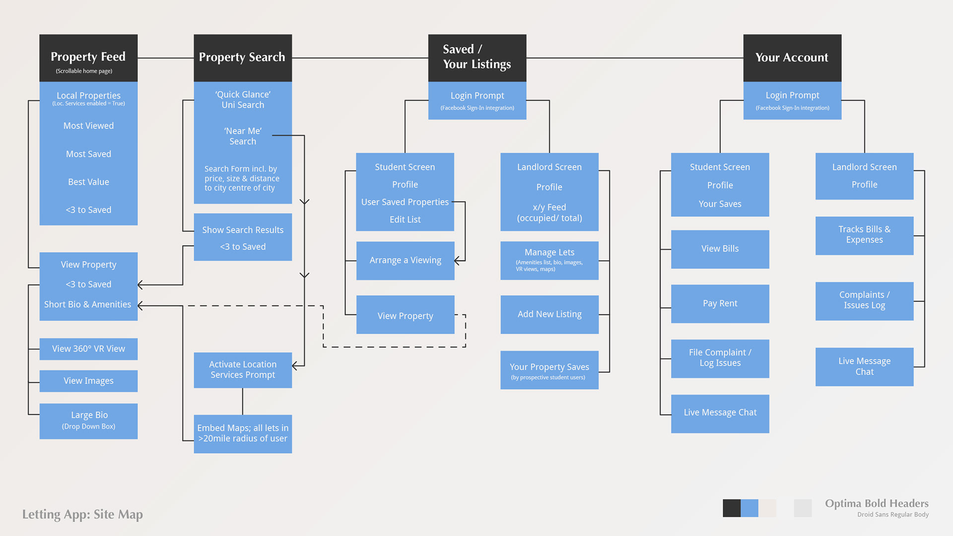
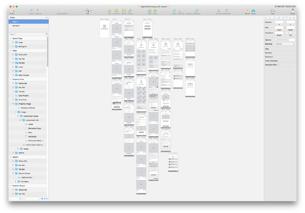
With the testing phase completed, I moved on to designing the final Site Map for the application as well as creating a Paper Prototype on Marvel.
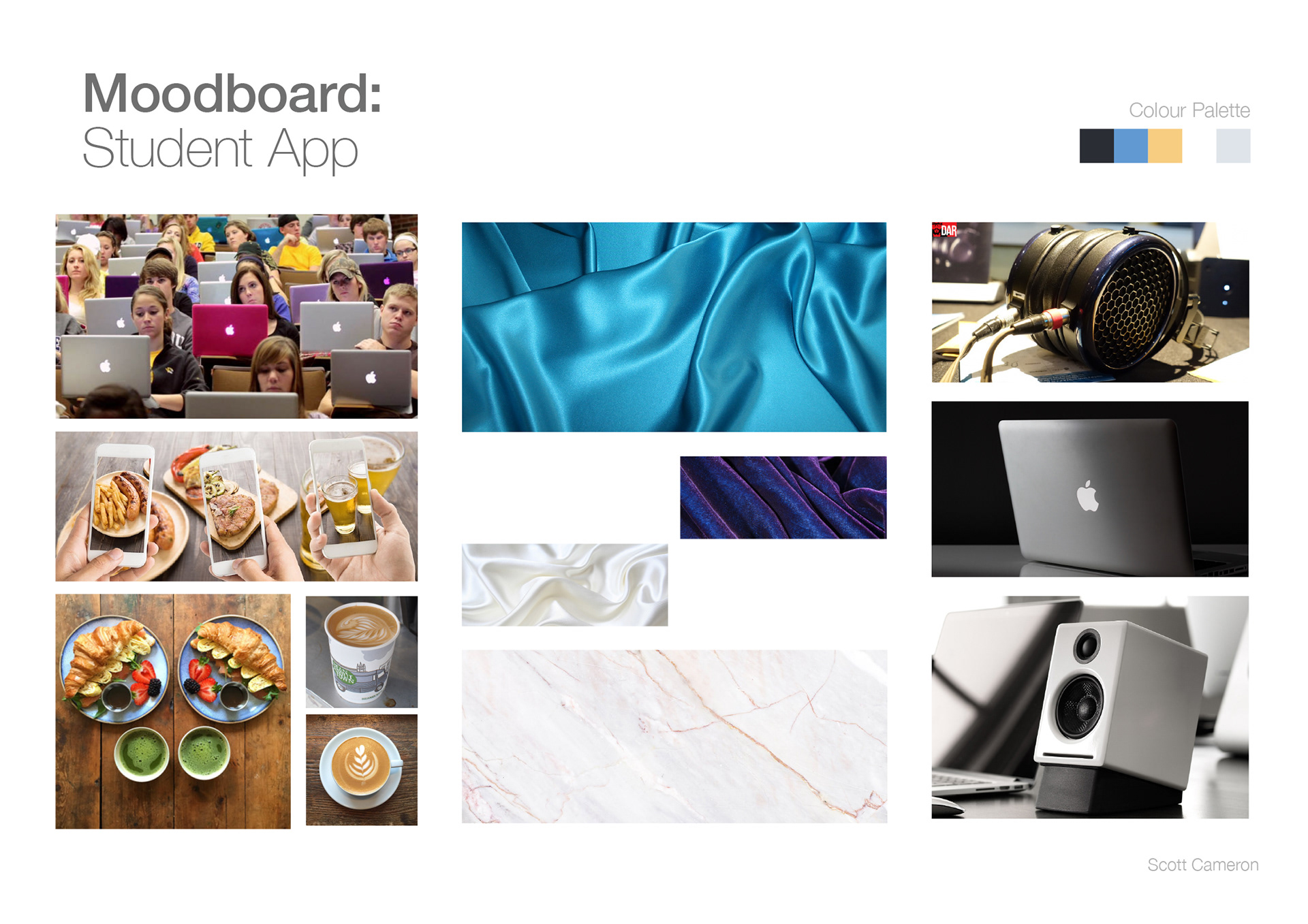
Moodboards
As part of my submission I was required to submit two A2 Moodboards which displayed two possible avenues of approach for the applications tone and colour choice.
My avenues of focus included aspects of modern living, Autumn (the season which most students start a course) technology and minimalism (focused on 'Instagram aesthetics')

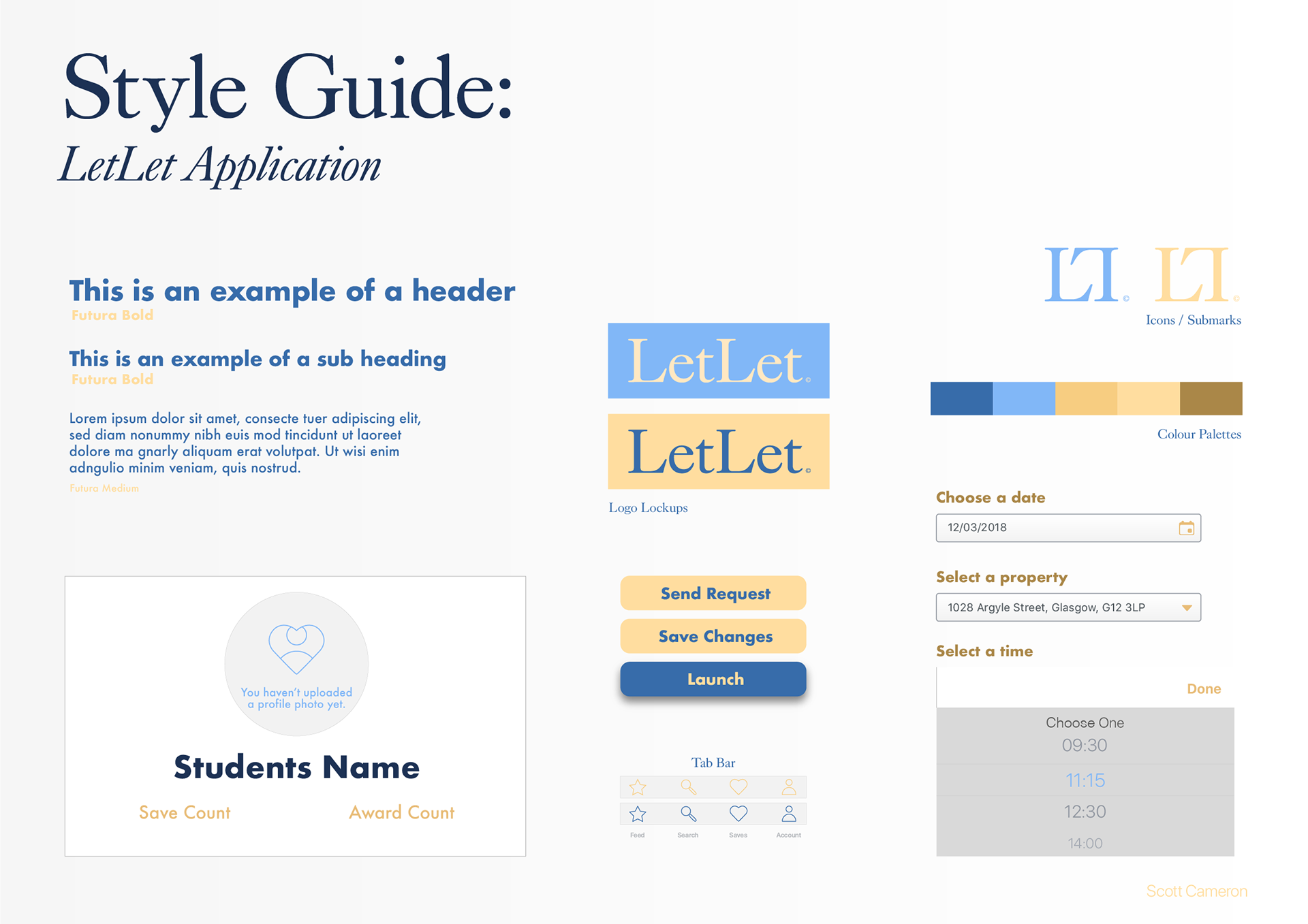
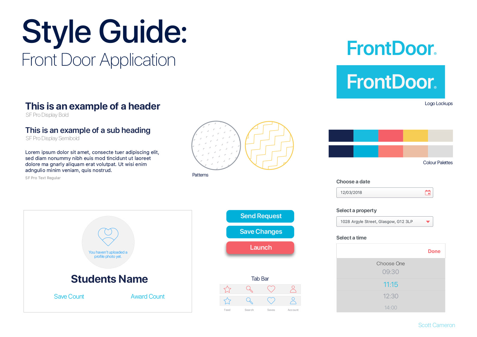
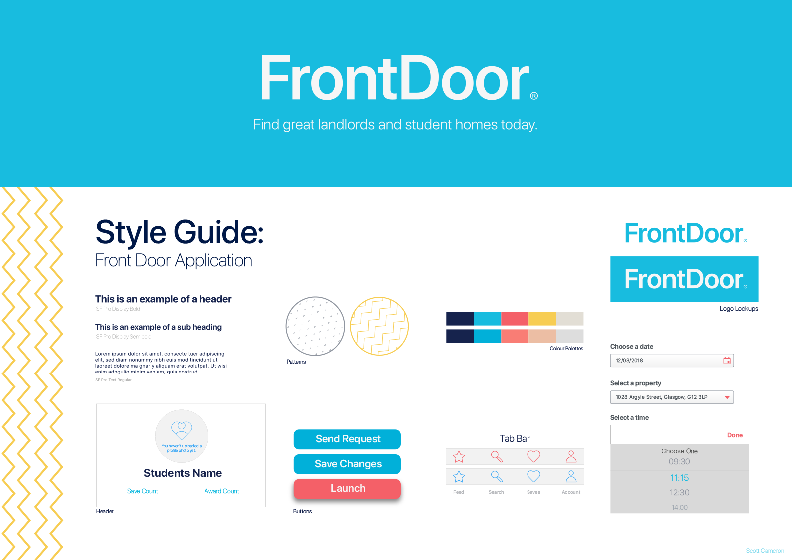
Style Guide(s)
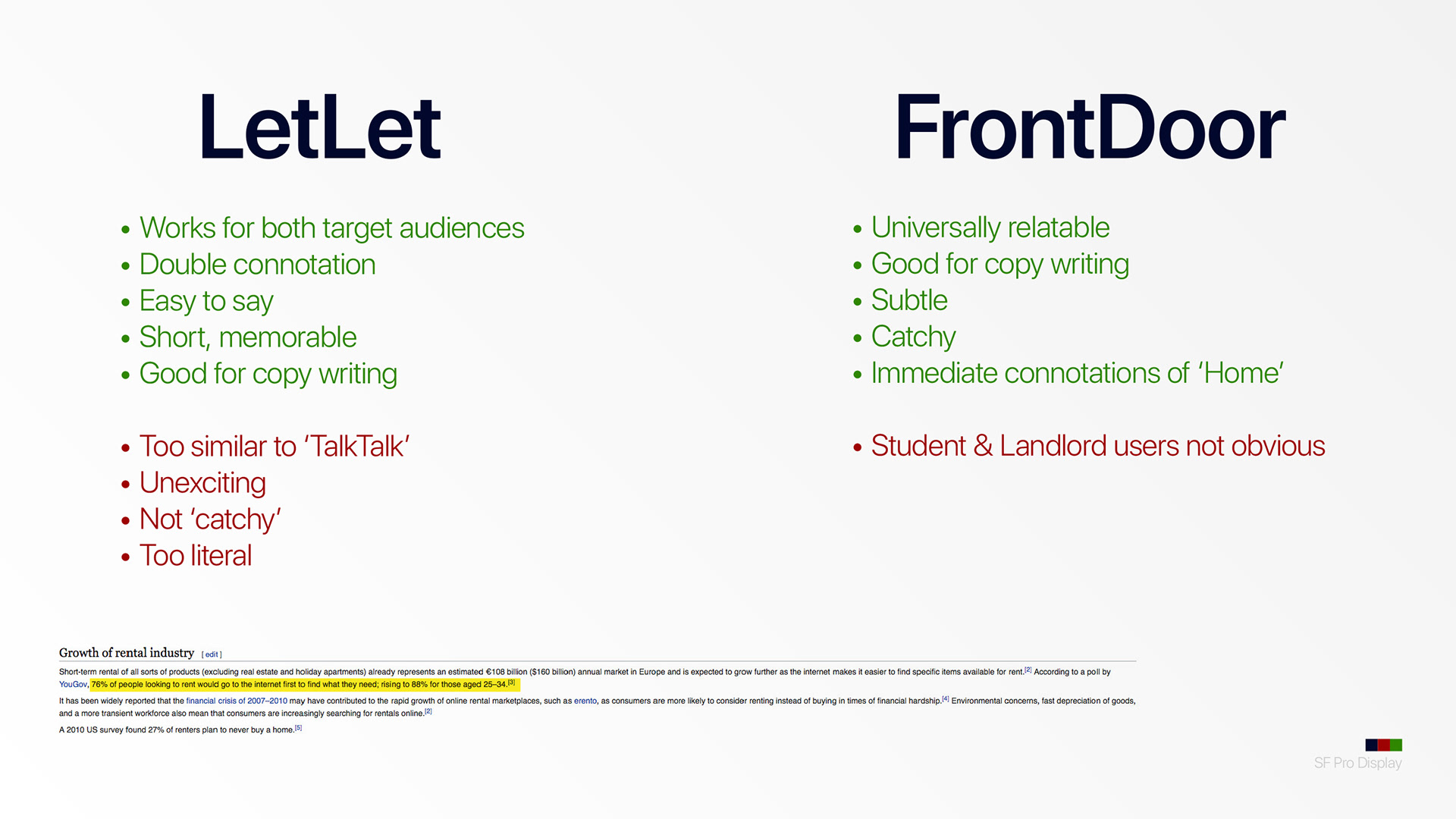
I was asked to develop two possible identities and two A3 Style Guides for the finished application. As a fan of word play I was stuck between two names; LetLet and Front Door.
LetLet worked well initially because it implied that it would 'let' landlords 'let' out their properties however it would also 'let' students find student 'lets'.
The "front door" is a term used by nations throughout the world to describe the main entrance to their home. As it fitted with the universal theme I was striving to create; I opted for this choice over the other.
Final UI Design
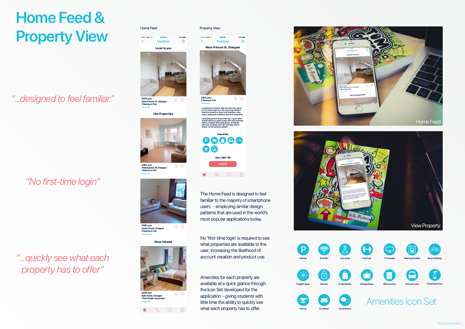
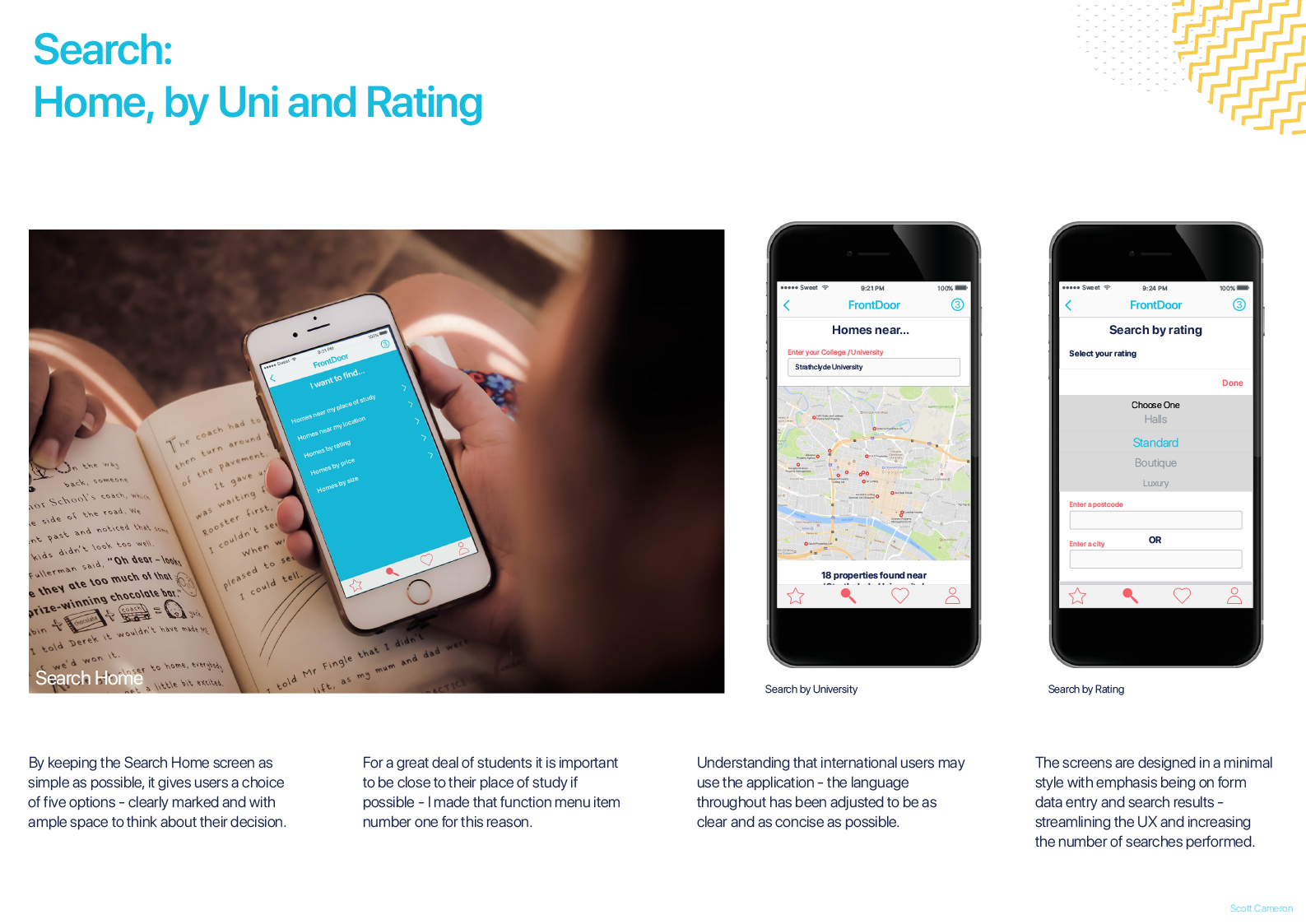
The finished design needed to feel clean and clear, with a real focus on the users and their needs. Choosing to include only four choices on the tab bar (splitting the account areas and search areas directly in half) reinforces this idea of ease of use; the left side is for searching, the right side is for everything relating to you.
To accompany each property listing, I created an icon set to display, at a glance, what key features each property contained. This would aid both students and landlords to quickly see / select the amenities that apply to each property within the app.
Final Prototype
The final prototype was created in InVision.
The prototype can be found and tested below: